Tyler — Product Designer based in Oakland, CA
Fitbit – Sync Banner
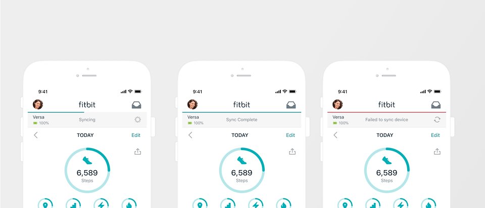
The state of the sync bar when this project started. My team was tasked with improving the perceived sync experience.
Sync has been in the top four reasons that users return their device or give our products a 1 star, and it costs us millions of dollars in customer service requests.
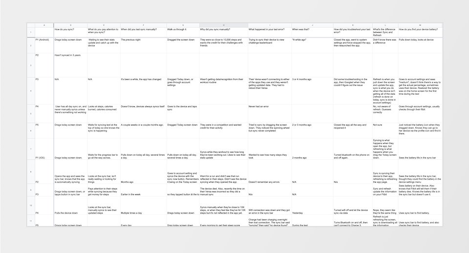
One of my first moves was running some user research, watching how users were currently interacting with the sync bar. One of our big findings was that users were willing to troubleshoot sync, but didn't understand what was going on.
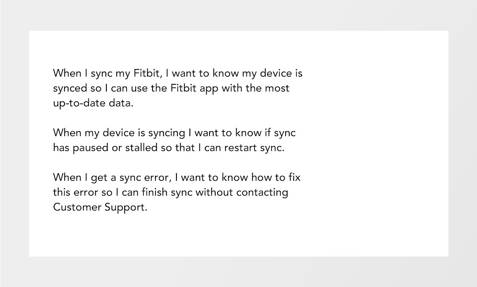
Based on our data and user testing, we landed on these three job stories as our focus for this project.
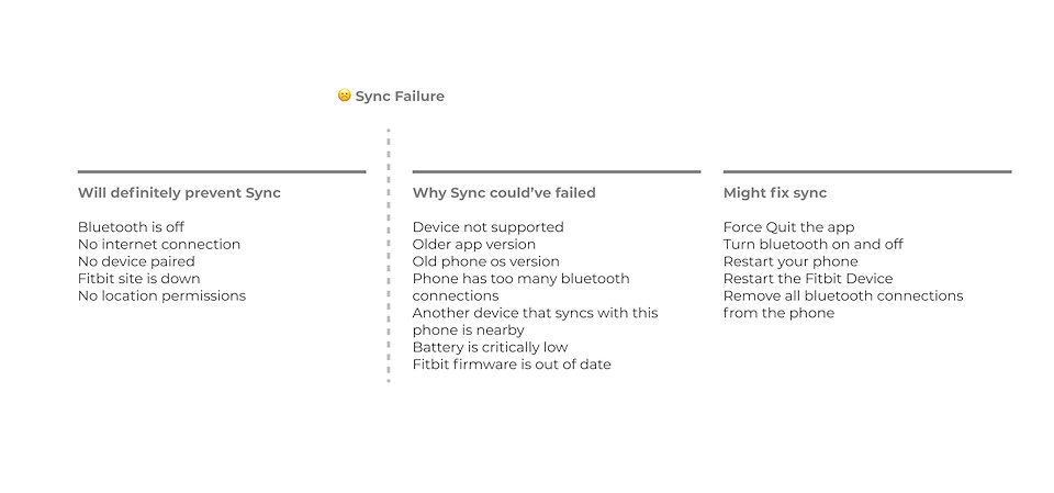
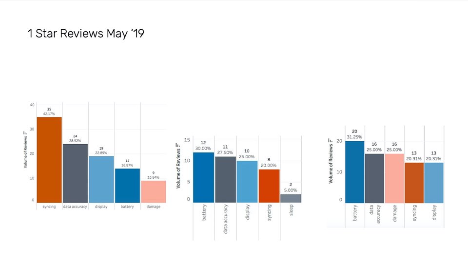
I partnered with our Customer Support (CS) team to read through email chat logs between agents and users having sync problems, and broke the issues up into three sections. This helped clarify what I was working on vs another team's sync initiative.
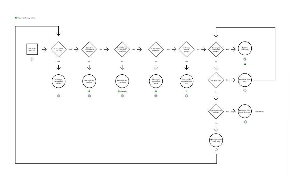
Using the information from our user research and from CS I outlined the ideal sync experience, and got this approved by our engineering, device, and leadership teams.
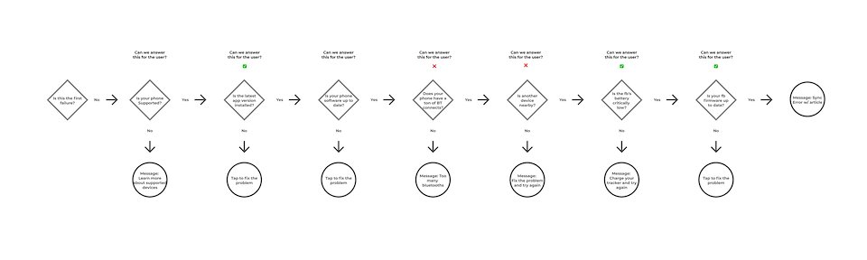
I also worked through a potential error flow, but this had to be scrapped due to the number of new components that needed to be built.
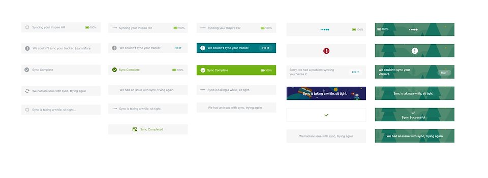
I explored a range of visual directions, from almost no color to full-color, animated experiences.
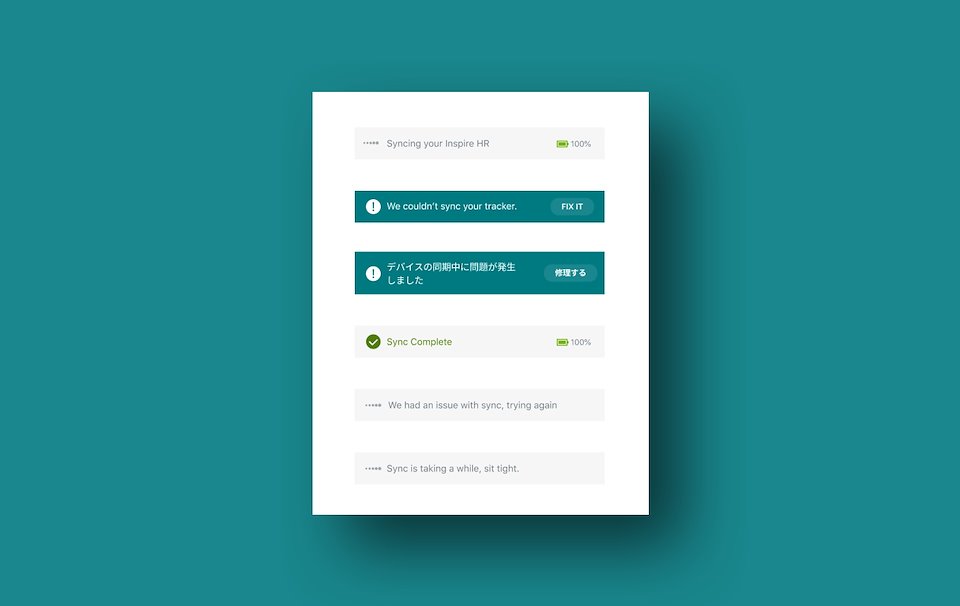
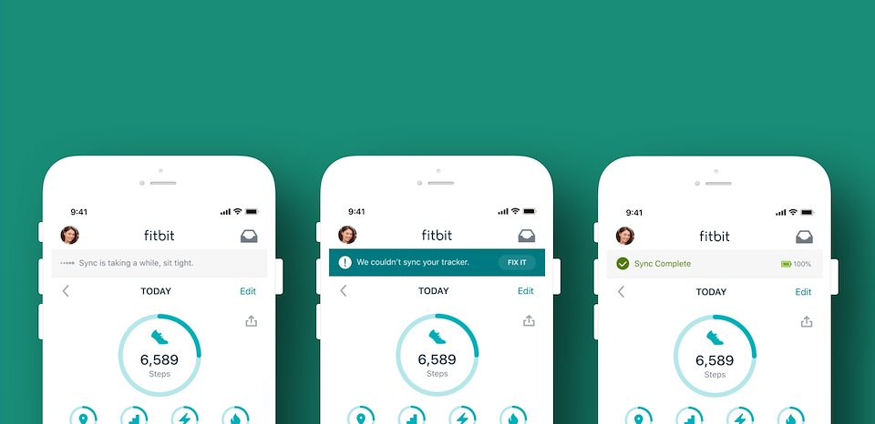
The final designs. The bar is a bit taller and text is left aligned to allow for more copy. The error color was chosen with the design systems team to alert users to an issue without alarming them.
Our first set of experiments are around the progress bar. We hypothesized that size the bar is actually fake, it's not set up for longer syncs and can lead to more user frustration.
I also partnered with our motion designer on these great new animations and helped facilitate the implementation with engineering.
Fitbit's Discover Library Next
HOFr